 TacComboDatePicker component
Hierarchy Properties Methods Events


|
TacComboDatePicker component
Hierarchy Properties Methods Events |
|
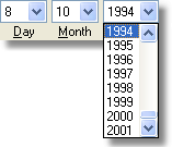
| The acComboDatePicker control is the panel with group of 3 combo-boxes used to quickly select the date (day, month and year). You can specify the range of years which can be selected, and selectable values for the Day box will be specified automatically, accordingly to number of days per month and leap year. The control contains the number of properties which specifies its look, i.e: date format, text for labels "attached" to the selection boxes, width of boxes, fonts, etc.
|
|
| Just drop the control on your form and specify the range of years which can be selected to the MinYear and MaxYear properties (MaxYear can be 0, in case if the highest selectable year should be current year).
|
|
|
| To determinate selected date — read the Date property, or the Year, Month and Day properties separately.
|
 In case if either Year, Month or Day value are not specified — the Date property return 0 (corresponds to 30.12.1899). In case if either Year, Month or Day value are not specified — the Date property return 0 (corresponds to 30.12.1899).
|
|
|
| If your application should be notified when the date in the combo-box changes — write the OnChange event handler.
|
|
|
| Other properties can be used to change the look of the control. For example, you can specify prefered date format, hide the labels "attached" to each combo-box, or change their placement relatively to boxes, and specify the spacing between boxes and labels.
|
|
|
 To clear the selection boxes — set Date property to 0, or call the Clear method. To clear the selection boxes — set Date property to 0, or call the Clear method.
|