 TacCheckGroupBox component
Hierarchy Properties Events


|
TacCheckGroupBox component
Hierarchy Properties Events |
|
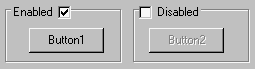
| The acCheckGroupBox component is an easy way to implement to your forms a group box with a checkbox instead of usual caption. When the checkbox is checked, all controls within a group box is enabled. When user uncheck the checkbox, all controls withing a group became automatically disabled.
|
|
| BoxAlignment | Controls placement of checkbox relatively to the caption. By default, checkbox is left-aligned. When the BoxAlignment is taRightJustify, the checkbox will be displayed to the right of text;
|
| Caption | Specifies a text string on the caption of checkbox;
|
| Checked | Indicates whether a checkbox is selected;
|
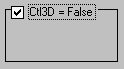
| Ctl3D | Determines whether a groupbox and checkbox above has a three-dimensional (3-D) or two-dimensional look;
|
| State | Determines the various states a check box (checked, unchecked or grayed).
|
| OnCheckBoxClick | occurs when user clicks the checkbox above the group box, or when the Checked property is changed.
|
| acCheckBox component.
|