Hierarchy Properties Methods Events


|
Hierarchy Properties Methods Events |


|
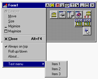
| The acCaptionButton component applies an additional custom button to the title bars of your forms + special menu item associated with this caption button to the system menu.
|
|
|
| Additional caption buttons is completely customizable and stand in close integration with the SystemMenu and, as any standard button on the title bar have built-in tool tips (Hint property). However, unlike the standard buttons which built-in to any window, acCaptionButton have a lot of incredible additional features! See description and snapshots below.
|
| The order of button on the title bar specified by BtnOrder property, but you can also separate buttons by any width of blank space specified in SeparatorWidth property.
|
|
|
| The image on caption button can be either Sign (you may specify the SignFont) or Glyph bitmap image. You can also specify the glyph image for button in pressed state (GlyphDown property).
|
|
|
| If you would like to allow user press the caption button - make AllowPress property True. If you would like to assign to the caption button any popup menu - welcome!, the required menu item will be available also in system menu at run-time.
|
|
|
| Any button can be in enabled (usual state) or disabled (user could not press it) state - see Enabled property, or invisible on the title bar at all - see Visible property.
|
|
|
| All these and much more cool features could be specified at design-time and does not require ANY line of additional code!
|
|
|
| See also CaptionButton's events for handling them.
|

|

|

|