 TacButtonsPanel component
Hierarchy Properties Events


|
TacButtonsPanel component
Hierarchy Properties Events |
|
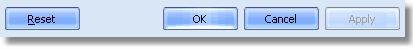
| The acButtonsPanel is an easy and elegant way to put standard buttons (like OK, Cancel, Apply, Help or some custom buttons) to your dialog forms. Supports vertical and horizontal buttons (TacBitBtn's), can show the button glyphs, the divider between buttons and the dialog contents and even size grip at the bottom-right corner.
|
| standard buttons
|
|
| skinned with ThemeEngine by KSDev.com
|
|
| First, drop the ButtonsPanel onto your dialog form and choose the placement of buttons (how the buttons should be aligned on the form, vertically or horizontally, see Align property).
|
|
|
| By default there is 3 visible buttons: OK, Cancel and Apply. If you don't need the Apply button, you can make it invisible, just set the BtnApply.Visible property to False. To take some specific actions when user clicks OK or Apply buttons (for example, save the program settings changed in the dialog box), write OnApplySettings event handler.
|
|
|
| If you need some custom button (for example, "Browse" or "Search"), set BtnCustom property to True, specify its text to BtnCustom.Caption property, and write OnBtnCustomClick event handler to take some specific actions when user clicks this button. If you want to display the custom button before other buttons (at the left or top of OK) — set CustomButtonPosition property to True.
|
|
|
| To control the width and height of buttons — use ButtonWidth and ButtonHeight properties. To increase or decrease the spacing between buttons — set ButtonSpacing property.
|
|
|
| Also the acButtonsPanel have some miscellaneous properties like ShowDivider (can display the thin divider line between buttons and the content of the dialog box), and ShowSizeGrip (displays the resize grip at the bottom-right corner of panel, useful for resizeable dialog boxes).
|
| acBitBtn component.
|